
Somewhere in the files of the National Park Service there is a form, typed in 1977, that settles an argument most people do not know they are having. It is the National Historic Landmark nomination for the Gamble House, and in its description of the exterior it records, with bureaucratic flatness, one of the most misunderstood facts in the Greene & Greene canon: the walls are covered with “36″ cedar shakes dipped in Cabot’s Creosote base stain, painted olive green.”
Olive green.
Ask most admirers of these houses what color they are and the answer comes back brown. Brown wood, brown shingles, brown timbers — an architecture of brownness, wearing the palette of a walnut sideboard at the scale of a city lot. The photographs seem to confirm it. A century of weathering seemed to confirm it. But the houses as the Greenes released them to their clients were not brown. They were green — deep, muted, olive-and-moss green — with brown reserved for the structure that framed the green, and the whole scheme was applied not with a paintbrush working over nailed-up siding but, in the most literal sense, by immersion. The color came in a barrel, and the shakes went into it before they ever met the wall.
This essay is about that palette: what it actually was, where the evidence for it survives, why the brothers built it from stain rather than paint, and — because the question arrives in this site’s inbox in a dozen forms — how a homeowner, builder, or architect gets honestly close to it now, with the products a modern paint store can mix. Like the woods themselves, the original materials are mostly gone. The reasoning is fully recoverable.

A Green House, Not a Brown One
The evidence for the green begins with documents and ends with forensics. The document side is the nomination form quoted above, which had the advantage of being written while the Gamble family’s own maintenance records were close at hand: cedar shakes, Cabot’s creosote stain, olive green. The forensic side belongs to the Blacker House, and it is one of the better detective stories in the literature.
When Harvey and Ellen Knell began their restoration of the Blacker House in the 1990s, the exterior wood had been blackened by decades of failed finishes. As the crew led by craftsman James Ipekjian removed the damaged material, they found on one of the original shakes a surviving speck of green stain no bigger than a pinhead. Analysis of that speck, and of the protected surfaces around it, returned the house’s original scheme: a deep moss green for the shingled walls, and a medium-dark brown for the timbers, rafters, and trim. That is the two-part chord the house wears today, and anyone who stands on Hillcrest Avenue can hear it plainly — a green body inside a brown frame, the wall receding, the structure advancing.
The Gamble House tells the same story with different wear. Edward Bosley, the house’s longtime director, has written of how earlier preservative coatings oxidized on the exterior, turning surfaces green-black in ways the Greenes never intended, and how the 2003–2004 exterior conservation project worked square inch by square inch to recover the original vision from under the accumulation. The brown-black Greene & Greene of the mid-century photographs — the one that formed most people’s mental image of these houses — is partly a portrait of deferred maintenance. The houses were darker than their neighbors, certainly. They were never black, and they were never simply brown.

The Barrel the Color Came In
To understand the palette you have to understand the product, because the Greenes did not invent their wall color any more than they milled their own teak. They specified it out of a catalog that every shingle-style architect in America knew: Cabot’s Creosote Shingle Stains, made in Boston by Samuel Cabot.
Cabot’s product was itself a piece of Arts and Crafts history. In 1882, at the request of an architect uncle, the chemist Samuel Cabot Jr. worked out a formula that would preserve exterior shingles without hiding the grain of the wood; he patented it in 1884, expressly for the “ornamental shingles now so much used by architects.” His insight ran opposite to the other wood-preservative men of his day. They wanted to drive chemicals deep into the timber. Cabot wanted to preserve color — to carry pigment into the wood in a vehicle of twice-distilled creosote, so that the surface stayed matte, the texture stayed legible, and the hue became a property of the shingle rather than a film on top of it. The Metropolitan Museum of Art keeps period Cabot advertising in its collection, including a 1903 lithograph of suggested color combinations for creosote shingle stains — deep greens, umbers, and grays arranged in exactly the muted chords the Greenes would build from.
And the application method mattered as much as the chemistry. The Gamble nomination’s word is precise: the shakes were dipped. Immersion coated every face and edge of the shake — including the surfaces that would spend the next century hidden from any brush — before installation. The color was not applied to the wall. The wall was assembled out of colored pieces, the way the dining room was assembled out of mahogany rather than painted to look like it. For architects who believed the material should be itself all the way through, a dipped shake was an argument, not a shortcut.

Why Stain and Not Paint
The choice of stain over paint was not a budget decision. It followed from everything else the brothers believed.
Paint is a film. It sits on the surface of wood, fills the small topography of the grain, rounds over the arris of every shake, and presents to the light a skin of uniform sheen. On a planed clapboard that may be acceptable. On a hand-split shake it is a kind of erasure — the entire point of a split surface is its texture, the thousand small facets that catch raking sun, and a film of paint buries them. Stain does the opposite. It penetrates, colors, and leaves the surface of the wood as the weather finds it. A stained shake wall at five in the afternoon is not one color but a shimmer of related colors, dark in the shadowed splits, lighter on the raised grain, the whole surface alive in a way no painted wall can be.
Stain also fails better. Paint fails by peeling — the film lets go, and the wall wears its failure as scabs and blisters until someone scrapes it. Stain fails by erosion. It fades and thins and asks to be renewed, but it never peels, because there is no film to peel. For houses whose owners the Greenes could not control past the day of possession, that was a durable kind of humility: the finish was designed to grow old gracefully rather than fail catastrophically. When the finish on these houses did turn black and sour in the mid-century, it was almost always because a later hand had applied the wrong thing over the right one.
The Colors They Could Not Choose
Half of the Greene & Greene exterior palette was never mixed in a barrel at all. It came fixed, in the materials themselves, and the stained surfaces were tuned to agree with it.
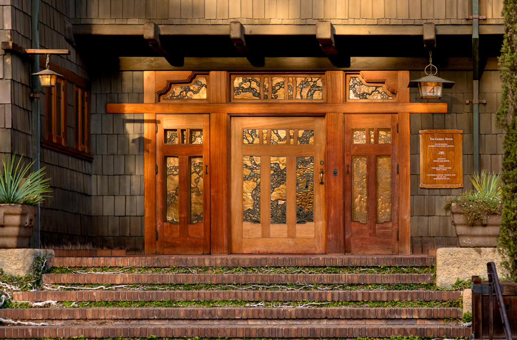
The clinker brick of the foundations and chimneys arrived from the kiln already colored — purple-black, iron red, toasted umber, no two alike, which was precisely why the brothers wanted the bricks everyone else rejected. The arroyo boulders in the walls and piers carried the gray-buff of the Arroyo Seco itself. The roofs were Malthoid, a bituminous membrane laid in sheets, reading from the street as a flat, non-reflective dark plane — a shadow held overhead. The terraces at the Gamble House were surfaced in handmade red mission tile. The hardware and straps were iron, blackened; the gutters and flashing threw off the warm glint of metal; the front doors held their own color in varnished teak and the amber-and-green of art glass. None of this could be repainted, and none of it needed to be. It was a palette of materials first, and the stains were chosen to sit among those materials as one voice in the chord — never to dominate them.
The Rule of the Arroyo
If there was a governing principle above all the individual choices, it was this: the house should take its colors from the ground it stands on, so that it appears to have grown there rather than landed there. The greens of the walls belong to the family of eucalyptus, live oak, and summer-dry chaparral. The browns of the timbers belong to bark and turned earth. The grays of the boulders are the arroyo, carried uphill. This is the same logic that shaped the brothers’ whole relationship to the Arroyo Seco — the house as a native of its landscape — executed in pigment.
It is worth pausing on how radical this was in 1908, because the standard American house of the day argued the opposite. It was painted to stand out — white, cream, sunny yellow, its trim picked out in a second bright color, an object displayed against its lawn. The Greene & Greene house was colored to stand in. On an overcast day the Blacker House very nearly disappears into its own trees. That was not a failure of the scheme. That was the scheme.

The Modern Barrel
Now the translation, and it begins with a piece of unusual good luck: the company is still in business. Samuel Cabot’s firm survives as Cabot, and it still sells exterior wood stains — the creosote is long gone from the formulas, as it should be, but the product category the company invented for exactly this kind of wall is intact. Its current lines include semi-solid siding stains and the old-line O.V.T. solid-color oil stain, and other manufacturers offer equivalents; any of them can be tinted to deep greens and browns. A revival builder in 2026 is not improvising here. The supply chain for this palette never actually closed.
The important decision is opacity, and the honest answer for most projects is semi-transparent or semi-solid rather than solid. A semi-transparent stain shows the most grain and gives the liveliest surface, but it holds deep color less strongly and needs renewal sooner. A semi-solid carries a rich, dark color while still letting the texture of the wood read through — on rough-sawn or split material it is very close to the period effect. A solid stain approaches paint in appearance and should be reserved for repairing schemes that are already solid-stained. Whatever the opacity, the sheen must be flat. Nothing betrays a revival exterior faster than gloss; the originals absorbed light, and a satin acrylic sheen on a shingle wall reads instantly, fatally new.
And if the project involves new shakes or shingles, honor the barrel. Few builders will literally dip today, but coating all six sides of each piece before installation — back, edges, and ends included — is standard best practice for exactly the reasons Peter Hall’s crews understood: wood colored and sealed on every face moves less, sheds water from its concealed surfaces, and never shows raw edges as courses weather. It is slower. It was always slower. It is also why the original walls lasted a century.
The Modern Chips
Color names, offered carefully. No modern chip is “the” Greene & Greene green: the originals varied house to house, they were tuned on site, and a century of analysis sits between us and the first barrels. But there are verified, currently available starting points. Sherwin-Williams’ historic Arts and Crafts colors include Roycroft Bronze Green (SW 2846) — a deep, gray-olive green in exactly the register of the Gamble wall — and the darker, bluer Roycroft Bottle Green (SW 2847), which leans toward the Blacker’s moss. Either can be had as a tint base for exterior stain rather than paint, which is the correct order: choose the chemistry first, then carry the color into it.
For the structure — timbers, rafter tails, outlookers, barge boards — the Blacker restoration’s finding is the guide: a medium-dark brown, distinctly warmer and browner than the wall, dark enough to read as structure but never black. Keep roughly that interval between wall and frame and the elevation will organize itself the way the originals do, the green mass held in a brown cage. Sash and casements went dark as well, so that the windows read as openings rather than as trim. A dark, dead-flat roof — charcoal or deep bronze-green, in whatever modern membrane or shingle the roof requires — stands in for the Malthoid.
Then test the way the Greenes’ own painters would have: not on a chip, not on a screen, but in large brushed-out panels on the actual wood, hung on the actual wall, viewed at morning and evening for a week. These colors live or die by the light that strikes them. Pasadena sun is a collaborator the paint store cannot simulate, and neither can whatever sun your own lot receives.

What the Palette Refuses
Knowing what to buy matters less, in the end, than knowing what to refuse, because the scheme is defined by its refusals. It refuses white trim — the single most common modernization, and the single most destructive, snapping the quiet elevation into a checkerboard. It refuses accent colors; there is no cheerful front door in this grammar, because the front door’s color is the color of teak. It refuses sheen. It refuses contrast for its own sake: no element is picked out, because the whole point is the ensemble.
The refusals were tested against history’s alternative, once. In the lean years of the Gamble House there was a moment when white paint came within a conversation’s length of the teak and the shakes — the story is told in The House That Was Almost White — and the horror of that near-miss is the best argument for the palette ever made. Imagine the north facade primed gray-white, the timbers erased, the wall texture filled. Everything this essay describes would have taken one summer to destroy.
So the modern order reads simply. Stain, not paint. Semi-solid, flat, on every face of every piece. A deep olive or moss green for the body of the house, mixed from a verified historic chip and proven on the wall in your own light. A medium-dark brown for the bones. Darkness overhead, materials left to speak their own colors below, and nothing — nothing — picked out in white.
The color came in a barrel and went on before the wall existed. It was never decoration. It was the house agreeing with the ground it stood on, and the ground has not changed its mind.